Say Hello to the New Asset-Map
What Our Updated Design Direction Says About Us
Today, we’re excited to launch a new overall look and logo for Asset-Map.
If you keep track of technology news, you may have noticed a number of high-profile rebrands lately, from WeWork to Mailchimp. A rebrand is no small feat, and we want to take a moment to explain why we’re going in a new direction.
We felt it was time for us to embrace a brand design that better aligns with how we see ourselves inside our own four walls, and to give you a better impression of what it’s like to collaborate with us.
Rebranding allows us to establish a solid foundation that brings a more cohesive and compelling story to our marketing materials.
Old to New
What the Asset-Map Brand Represents
When we’re working together in our Philadelphia office, we often talk about building Asset-Map on four core attributes.
As people who serve advisors, we want to be:
Honest
In every interaction, we place transparency and real talk at the top of the priority list. You deserve nothing less than working with a company that respects you.
Engaging
Through our technology,we provide a refreshing and empowering experience to advisory owners and their clients.
Collaborative
We want to be a company that listens to our advisors more than we talk to them. For us, that means being supportive, empathetic, and thoughtful toward the needs of our clients.
Credible
Advisors are judged by how well they help a client reach financial goals. We want to help create results-driven decisions that are relevant to the moment and support advisors to provide the best advice possible.
We used these four core principles to point our visual brand in the right direction.
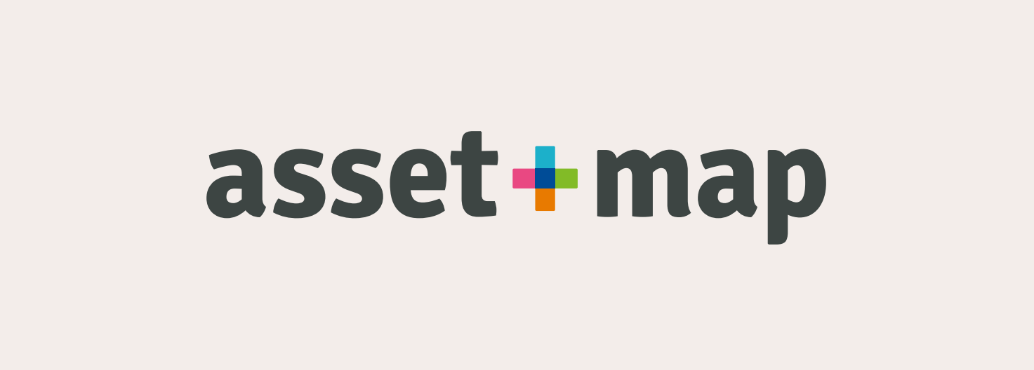
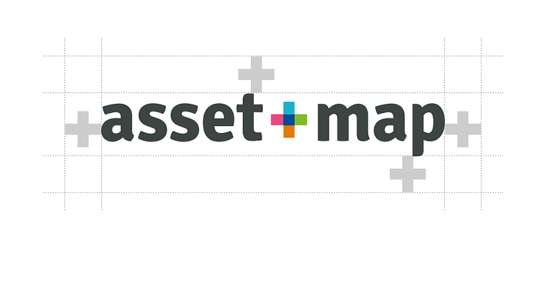
The New Asset-Map Logo
Asset-Map is used all around the world as a standard way for families and financial professionals to communicate more clearly, and better understand their finances. Each person that uses Asset-Map can leverage it in a unique way.
As a result, we wanted our logo to communicate the broad way that people utilize Asset-Map to understand their financial picture and make better decisions.
In addition to updating our font to be more approachable and engaging, we’ve swapped out the dash for a plus sign. And if you’ve used Asset-Map before, you may recognize that the illustration in the middle of the logo actually is an Asset-Map.
Within an Asset-Map, we use containers to showcase different types of assets, and each one gets a designated color for easy readability.
The “plus” sign in the middle brings all these containers together to create a simple, organized, positive, and approachable representation of an Asset-Map itself.
The icon also serves as a fresh take on the wayfinder icon, or the “X marks the spot” idea on a map. An Asset-Map shows where you need to go on your financial journey, and this new logo reflects that intent.
But the logo isn’t all that’s new.
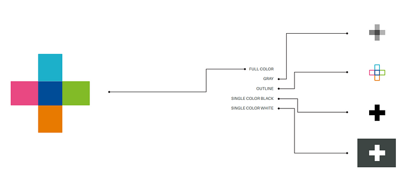
A New Color Palette
We love financial advisors, but as a group, we tend to be a little uniform in our choice of colors: Blue. Light blue. Navy blue.
We initially took the same approach with our first logo.
As we went in a new direction, we wanted to enliven the conversation with bolder takes on classic colors, which you can see in the wayfinder icon and in the Asset-Map product.
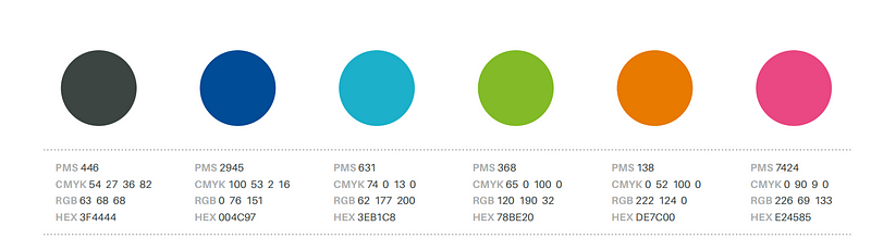
The colors reflect different containers in an actual Asset-Map, and while bold and lively, we also don’t think they’re too loud and trendy. We think they fit together just right.
One More Update: A New Tagline Too
Along with the new visual brand, we also recognized a need to update how we communicate the value we provide to our community.
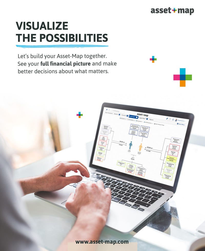
Our new tagline speaks to the way that an Asset-Map helps families and their advisors see an entire financial picture at once in a clear, concise way so they can make the best decisions for their circumstances. Here it is:
“Visualize the Possibilities”
Supporting our new tagline is additional text that seeks to break down the lines between advisors, clients, brokers, and the other relationships in financial services.
We don’t just empower advisors or individuals, our focus goes deeper than that. We empower humans.
“Empowering humans to see their full financial picture and make better decisions about what matters.”
Our hope is that when you see Asset-Map now, you see a learning-focused company that believes in the importance of people’s ability to understand their finances and communicate clearly with their personal financial professional.
Over the next few months, you’ll see the visuals around our brand updating everywhere you see Asset-Map represented.
Thank you for being part of our journey so far. We can’t wait to see where we go together next.